

Some people find watercolours a struggle to use as they require a lot of control, but my challenge is going to be involve working out what makes watercolours distinctive from other mediums like gouache.

When I was a graphic design student we were exposed to all types of materials but tended to use gouache for most projects. Primarily because when you’re colouring in large graphic shapes like lettering, gouache gives you a clean, flat, even application.

Gouache also tends to sit on the surface of the paper rather than be absorbed into it, however you can water them down and use them like watercolour paint. Although I do recall that when watered down sometimes it can leave some residue behind, like a ring around a bathtub effect. Nonetheless for practical and financial reasons whenever I needed a watercolour effect I stuck to my gouache set.

My first big adventure with watercolours came on a trip to Antarctica in 2005. I didn’t use them on-location the way I do now as I wasn’t confident enough, instead I would sketch on location then return to the ship and paint up my ideas at a table.

Over the next few years I began to use them more regularly out on location. However I wanted to get away from using them as a ‘colouring in between the lines’ medium. Unfortunately that meant I either painted very time consuming detailed pictures or the other extreme, wildly expressive. Neither felt completely natural to me, like I was fixated by some dictionary definition of what watercolour painting should be and look like rather than what felt right to me – if that makes sense.

I have come along way since then but I’m hoping to be even more compfortable with the medium over the next few weeks.
Exercise 1

BRUSH TESTING
Some would say brushes are almost or just as important as the paints themselves. Every expert will tell you that if you want to take your watercolours seriously you need to invest in a good set of watercolour brushes so that was my first step.
After spending some time researching online I eventually rounded out a modest list of suggested brushes for beginners. To be honest reading a lot of blogs by watercolour experts was probably more overwhelming than useful. In no way am I doubting their credentials but they were all recommending different brands, brushes and sizes, in the end talking to the shop assistant was much more helpful and it turned most of my existing brushes from my student days were pretty good ones. So I saved a few dollars and only needed to buy some larger ones.
RESULTS


My testing was simply to see if there were any definitive differences between each brand, with the fous on how it felt in hand and the way the paint dried too. Turns out some of the better results came from my older brushes which were a combination of Winsor & Newton Cotmans and Roymac Golden Sables.
BLENDS
Then I did a mini-refresher to see what methods work best when blending and layering. This, for me, is the main reason anyone would use watercolours.
RESULTS
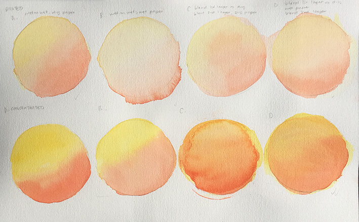
The smoothest graduations seemed to come from when the paper was wetted first, even when I allowed the first layer to dry before re-wetting it again to add a second layer.


Once all the examples had completely dried they weren’t all that bad. I guess the differences were more about the ease of applying the colours, as some were harder to control than others. Which is an imperative point because you want to feel comfortable and in control when using this medium.
LAYERS
The point of this exercise was to A: see how many layers of the same colour could be applied and B. how many layers in general could be applied until it became ineffective.
RESULTS
Layering with one colour only

There are five layers of the same colour here and with each new layer less water was added, however it looks like there are only 3-4 layers.
Layering with two colours

Again this has five layers but looks more like three.
Layering with three colours

This has six layers with the last, Payne Grey, barely making an impact. It only seemed to hold when applied quite heavily but a lot was repelled off the surface. To be honest, it looked better at three layers anyway so maybe there’s no need to go that far.
Next post
The Creative Plan – Day 2 Watercolour Paints
Previous post
The Creative Plan – Multicolour Pencil Review