
This exercise was inspired by an earlier one in relation to negative painting. It became very apparent when I finished the picture, where I wanted to create both atmospheric and spatial depth, that the results turned out much better than expected. So this new exercise was to find out whether I completely fluked it or actually knew what I was doing.

To make it fun I based the theme around some of my favourite films after all movie directors know how to create atmosphere and drama. Then to take it completely over the top they would be designed to be inserted into snowdomes.
Two of the three films are childhood favourites – The Empire Strikes Back and Indiana Jones and the Temple of Doom. The third is one of my all time favourite films, a Japanese animated movie called Akira. They’re all very visual films with iconic scenes and landscapes to them. Admittedly there were many more to choose from but part of the deciding factor was that they had very distinctive colourings, tonal values, etc from each other so that would also challenge my painting skills too.
WAMPA CAVE

In the film, Luke Skywalker is scouting the icy terrain of Hoth when he is captured by a local beastie called a Wampa – I guess they’re like a very gnarly, carnivorous yeti-like creature that lives in an ice cave.
The cave is not unlike a freezer in desperate need of defrosting – it’s cold, dry, icy and when there is a large, hungry beast lurking about preparing to have you for dinner, its no magical winter wonderland. It had to felt claustrophobic and ominous. Also in the movie the Wampa is hardly seen, a shadowy creature and that’s how I wanted to portray it.
This one was probably the easiest to execute and the simplest in terms of colour palette. I love icy snowscapes because they’re clean, crisp but very bold. Even though this is a cave I still wanted that stillness and dryness of a polar landscape.
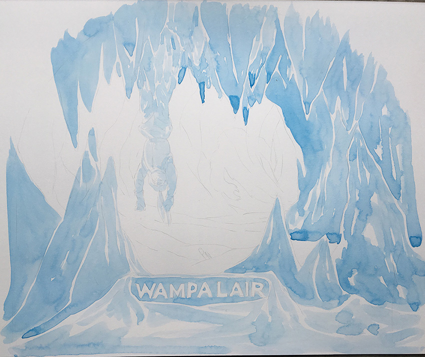
This kind of setting is very uncomplicated which means your approach has to match, ie not overwork it. One way of dealing with that was to limit the number of colours used, so for the bulk of the layers I stuck with Cerulean Blue, applying it a bit more heavily as I went along.
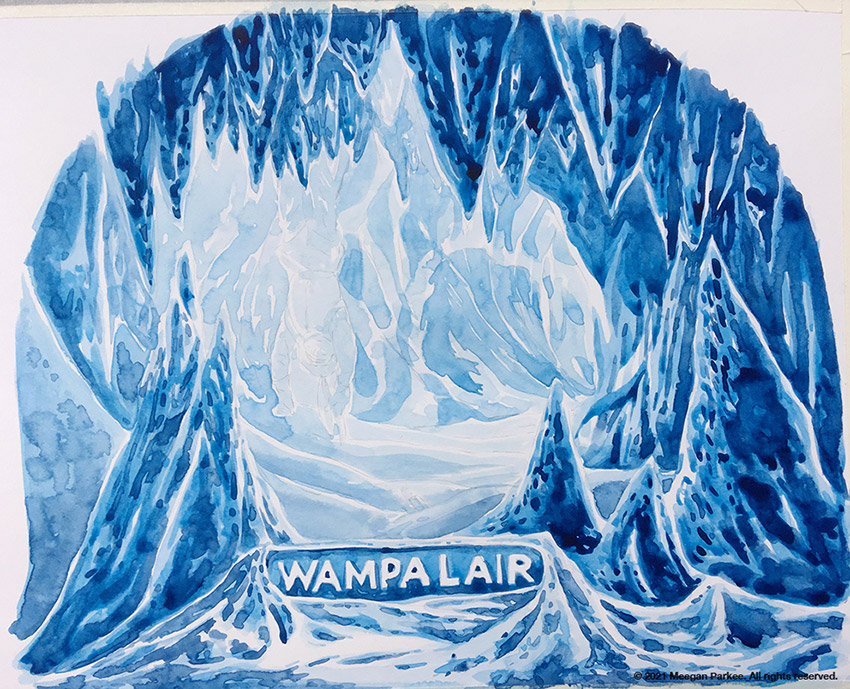
It was only when the layers of Cerulean stopped being effective when I used Prussian Blue to give the scene more depth, but it was used sparingly and only where it was needed like in the foreground.


TEMPLE OF DOOM
The second movie in the Indiana Jones collection and the first one I saw at the cinema back in the 80s. This is the big action scene at the end where our heroes are caught up in an out of control cart chase through a long dangerous tunnel system of underground mines.

This was on the other end of the temperature scale – it was hot (I think there were lava pits?), dusty and chunky. Negative painting works best when you put down the brightest colours first and then you slowly build up or shape in everything else around that. My base layers were Yellow Ochre then Cadmium Orange, and some Cadmium Pale Red to give it some “fire”.


I used Indian Red, which is more of a dusty red-brown colour for the rocks, hoping that would be enough to give the rocks and interior some definition but when it dried it was quite soft. Van Dyke brown gave it more fullness and depth, but it took a few layers.

Painting the rocks was really challenging as they started to look more like large intestines, maybe my brush was too big as it kept giving my rocks rounded edges. The only way to remedy this was to use a dagger brush to put in some detail and texture into the rocks.
Not that this is an excuse but I couldn’t find any clean images of this whole scene, probably because it doesn’t actually exist. When I came up with this idea the memory of this moment was obviously me mashing together a long sequence of the entire scene into one image!


Something else I had to tackle was the fine detail in the figures. I really wanted them to be distinguishable but it was hard detailing it in, even with a fine brush. The more I worked on it the muddier it got, I guess that’s something you cant really do with a semi-opaque medium. Reluctantly I had to resort to some fine pens and white markers to help lift those areas.
NEO TOKYO
For those of us living in western countries when Akira was released back in early 90s many believed it was the champagne cork that popped open the world of Japanese anime and manga. Our experience so far was the more family friendly cartoons like Kimba the White Lion, Astroboy or Battle of the Planets. Akira was not made for children.

Briefly, Tokyo is a forgotten, pessimistic, unstable world that is trying to claw its way back to prosperity after suffering a devastating, apocalyptic-like destruction caused by what seemed to be the unnatural powers of a young child. An angry, down-trodden teenager, Tetsuo, whose only enjoyment is going up against rival bikie gangs accidentally absorbs those same powers and goes on a rampage at the world that’s never done him any favours.
Its very graphic both figuratively but more importantly visually speaking. It’s probably one of the last lot of animated films created by traditional methods, ie hand-painted, and that’s what makes this film so breathtaking and impressive. There is so much attention to detail not only in the backgrounds but in the painstaking, herculean task of constructing the animation, frame by frame.

The scene I chose is pretty much at the beginning, and it is that moment when you realise you’re about to witness something really unique cinematically. Kaneda, is our hero and Tetsuo’s best friend but this is before the plot unfolds. We see them scream through all the abandoned highways of Neo-Tokyo bike rumbling with their enemies, the Clowns. Its a spectacular piece of work, not just that it moves like a real-life action film but the treatment of the night-time neon filled cityscape laden with so many colours and lights is bewildering.


I thought that would be a great example for negative painting and when it came to tackling all the various building lights that’s when this technique made it easier. Instead of trying to paint in all the little window lights towards the end, it became my second stage. Then when it was time to actually paint the building I just “blocked” them in. However in some sections I did paint some more yellow and orange lights in but that was more to add some texture to the layers.

This one became a bit of a passion project for a while taking way more time to finish than planned. The key challenges was doing justice to the background and even though it envelops the entire space it’s not flat nor was it originally created just for decorative effect. It has three distinctive tiers – foreground, middle and back, and I had to make sure with all the layers of colour I was applying to be conscious of not losing those sections.


The easiest part was the glimmering headlights and street lamps, and were approached the same way as the lanterns and light bulbs in the Temple of Doom picture. Basically with a clean brush, I painted on a bit of water then buffed out the colour beneath, then sponged off any water with a tissue at the end.


REVIEW
Using negative painting in a pictorial setting is a great way to add drama and theatre to a scene, it’s also helping in creating depth of field. Even though they took me a looong time to complete, I think it just comes with the territory – its that attention to detail that makes the overall picture so convincing and effective. So if you cant commit to that it may not be as successful..?
Again, the overriding issue with watercolours is that when they dry it looks so different. Those sections where I wanted really wanted deep, dark contrasting colour kept drying lighter. I found myself constantly going over these areas trying to build it up more and more (plus I also didn’t want to use blacks or greys) and there’s only so many layers you can add until it stops ineffective.
Upon review I feel there isn’t enough spatial contrast between the foreground and background but I don’t know if its because I’ve been looking at them so much and being too critical. Overall, I’m quite happy with them in fact happy enough that I went and order actual snowdomes for them.


Previous post
The Creative Plan – Day 8 Watercolour Paints
Fantastic work Meegan! I love the ‘diorama’ feel of the work. Also the detail shown from your layering and close ups. Brilliant idea for the snowdomes – really cool!