


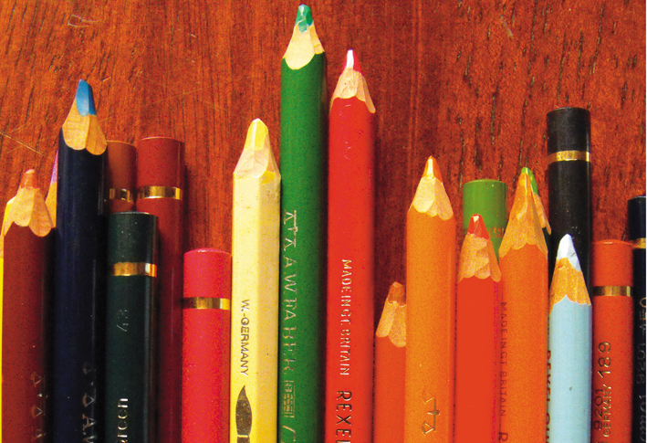


The design series I’m working on has a circus theme and there are twelve designs all up. Before I started I wanted to work out the colours combinations, so I printed out little thumbnails and used my watercolours to do a dummy run. Then when I was ready to start I used them as a reference guide. I also wrote the names of the pencils and the order in which I used them in just in case I had to finish it over a few days or wanted to use the same combination for another design.

Eventually I will get them professionally printed, more specifically digitally printed. With that in mind it was important for me to test out my materials because what looks great on the original, when reproduced the colours can shift.
I was made aware of this when I reprinted some watercolour art and found all my yellow tones looked the same. Some of the lighter tints were completely “bleached” out so I wanted to home test my colour pencils before starting.
I drew up little swatches of each pencil on the same paper I was using for my artwork. I then scanned them as hi-resolution images and printed them out on my desktop inkjet printer. It’s not a completely accurate representation as inkjet printers produce different quality from a laser printer, but I felt that it was adequate enough.


RGB to CMYK
I dont want to go into too much detail but when you’re setting up artwork for professional printing, especially on paper or a hard surface, its important to convert RGB (Red, Green, Blue) images to CMYK (Cyan, Magenta, Yellow, Black). If you’ve ever printed out an RGB image and noticed colour shifts or a lack of intensity compared to what you see on your computer screen, it’s because your printer uses CMYK toner. You are printing out an image made up of 3 colours through a machine that reads images through 4 colours.

In a nutshell, RGB images are meant to be viewed through a light source like a computer screen, cinema screen, tv, phone, etc (dont ask me to explain, its a combination of colours, a light source and mixing them optically) and CMYK is traditionally the preferred format for printing, eg. posters, business cards, brochures, magazines and so on. I say traditionally only because these days if you drop a document down to your local 24hr print-copy shop they are happy to print jobs containing RGB files.
COLOURING IN LARGE FLAT AREAS

What I remember being taught in my graphic design course is to not be too heavy handed when colouring in large areas of one colour, or even when blending in multiple colours. Colour pencils, as well as graphite drawing pencils, are very soft and wear down quickly.
Even colouring in a 1″x 1″ square, a sharp pencil can become blunt halfway through and you end up with assorted thick and thin lines. The rule of thumb is to always draw and colour with a sharp pencil in this regard. (I was also taught to hold the pencil at a 90˚ angle, but that feels a bit unnatural to me).

USING A STANLEY KNIFE TO SHARPEN PENCILS
The only time I use a pencil sharpener is if it is a HB or 2B graphite pencil, anything softer I use a stanley knife (I think in the U.S they are called boxcutters). Again, it might be me, but the angle in which a pencil goes into most sharpeners is at an acute angle where the softer leads tend to break while sharpening.
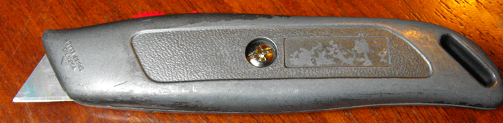

Holding the pencil in one hand and the knife in the other, place the knife blade against the area you wish to remove. Then using your thumb on the hand that is HOLDING the pencil, push the knife down into the wood to remove it. Try to finish the move before reaching the lead as you dont want to get rid of this. Slowly rotate the pencil around until you have evenly removed the same amount of wood.


Next is the lead itself. Using the knife lightly scratch away the lead to create a point, like you were gently sanding or polishing something, you dont want to be cutting off large chunks of lead. If you have cut away enough wood then for the next few uses you’ll only have to sharpen the point.


LAYERING COLOUR
So now onto my work… Before I start colouring, or do any finished artwork, I always rest my hand on a piece of paper, any type is fine. It stops my hand from smudging the work underneath as well as not “soiling” the paper with the natural oils of my hand, or whatever grit, food crumb and paint marks I might be accommodating.

Like cross hatching, I think it’s important that your lines run with the plane of the shape. So in this case it’s better to colour in long vertical lines rather than horizontal.
This type of colouring in requires layered treatment, which is the better option than trying to nail it in one go. Although it calls for some patience and time, you have more control. It also doesn’t wear down the tooth of the paper, and if you are blending in other colours it’s the only approach. It’s very much like the shading principal, which is shade in your light areas first, then build up to the darker tones. Therefore, start light then build up the intensity.


I hope that was helpful to you, if anyone has any questions I am happy to answer them as best as I can. And as mentioned earlier, I would love for others to post comments on their experiences/tips/feelings, etc on this medium.
Thanks for your time,
Meegan.